Activsion
Gaming Product and UX
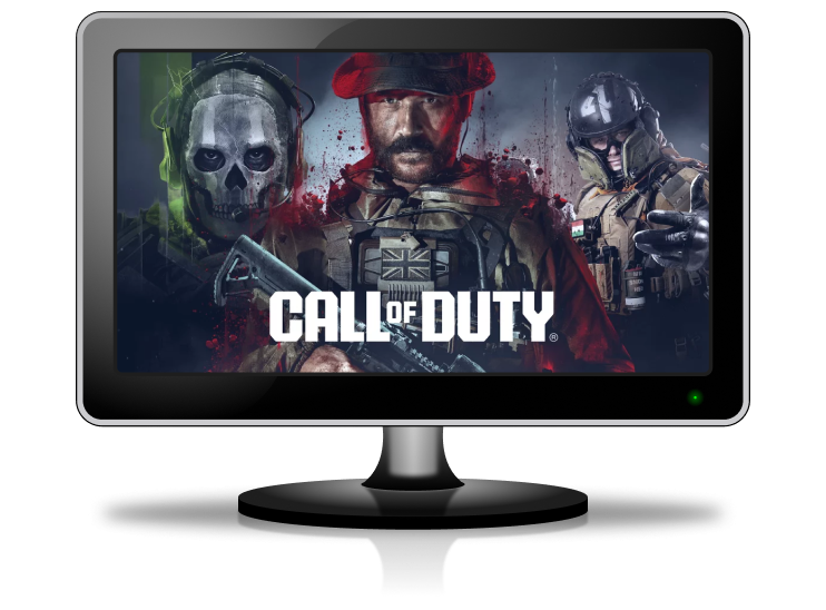
Overview
I lead digital product initiatives at Activision, focusing on marketing technology, consumer platforms, and internal tools for Call of Duty. My role bridges design and product strategy, guiding cross-functional teams to deliver experiences that support global campaigns and improve player experiences. From early concepts through launch, I work with studios, engineers, and business stakeholders to align goals and bring impactful solutions to market.
Role
Product, UX, UI
Timeline
June 2021 to Present
Tools
Figma, Miro, Photoshop
Call of Duty Stats
Our team created the stats feature for Modern Warfare II and III, Warzone, and Black Ops 6, providing players with in-depth combat records and leaderboards. I contributed to prototyping the concept, collaborating with User Research to define key features and usability, and designing a visually intuitive navigation system for exploring stats across multiple titles and modes. A significant part of my role involved aligning with studio leads on how stats should be organized and accessed, while also navigating backend limitations that required data to live in multiple systems.
Project Insights
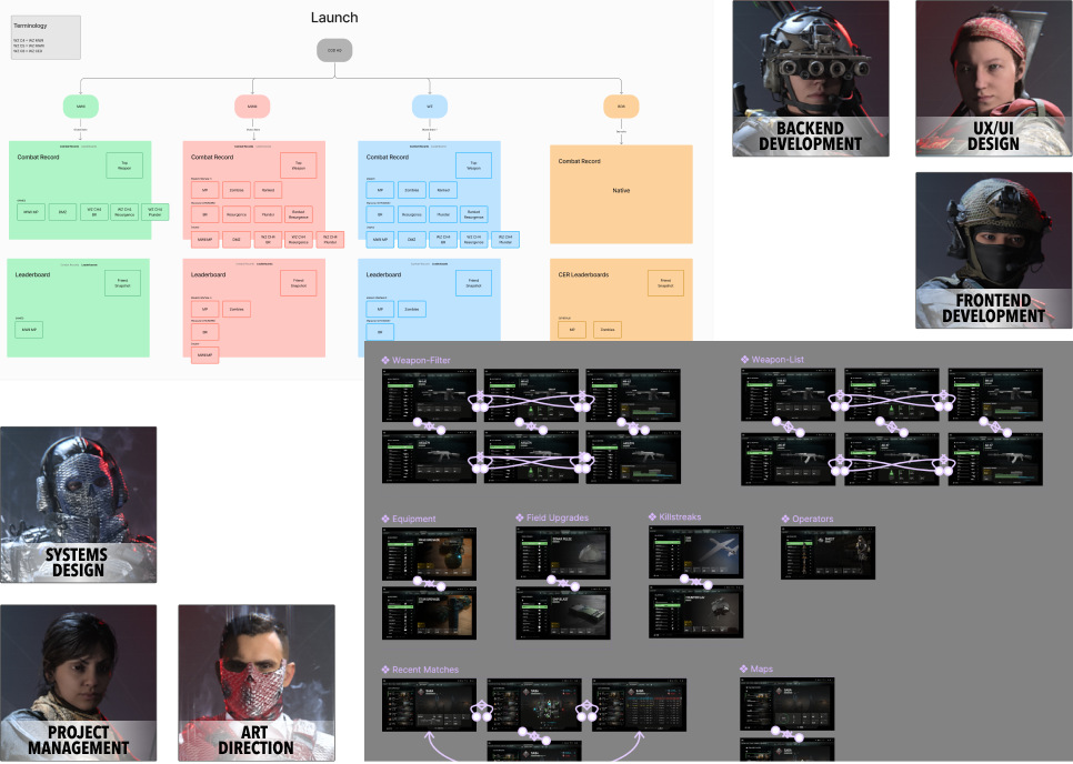
Cross-functional team efforts brought this feature to life
Challenges: Limited memory, aligning with studio timelines, organizing stats for casual and hardcore players, and ensuring frontend-backend integration.
Approach & Outcomes: We optimized architecture for memory limits, refined UX to cater to different player levels, worked closely with developers to design flexible navigation that accounted for data living in different systems, and stayed aligned with studios on timelines. This resulted in a high-performing, intuitive stats experience.
Learnings: Successful testing requires sufficient player data, early data instrumentation is crucial, filterable stats were not as intuitive as anticipated, and players prioritized their career stats as most valuable.
Warzone Recruit a Friend
As the sole UX/UI designer for the Warzone Recruit a Friend web experience, I collaborated with business stakeholders, studio teams, developers, and project managers to design and implement a first-of-its-kind feature for the franchise. This program allowed players to invite friends to join the game and offered both in-game and web components, creating a seamless experience across platforms.
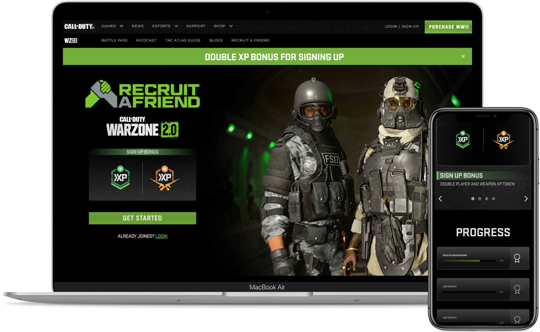
Promotional site on callofduty.com
Project Insights
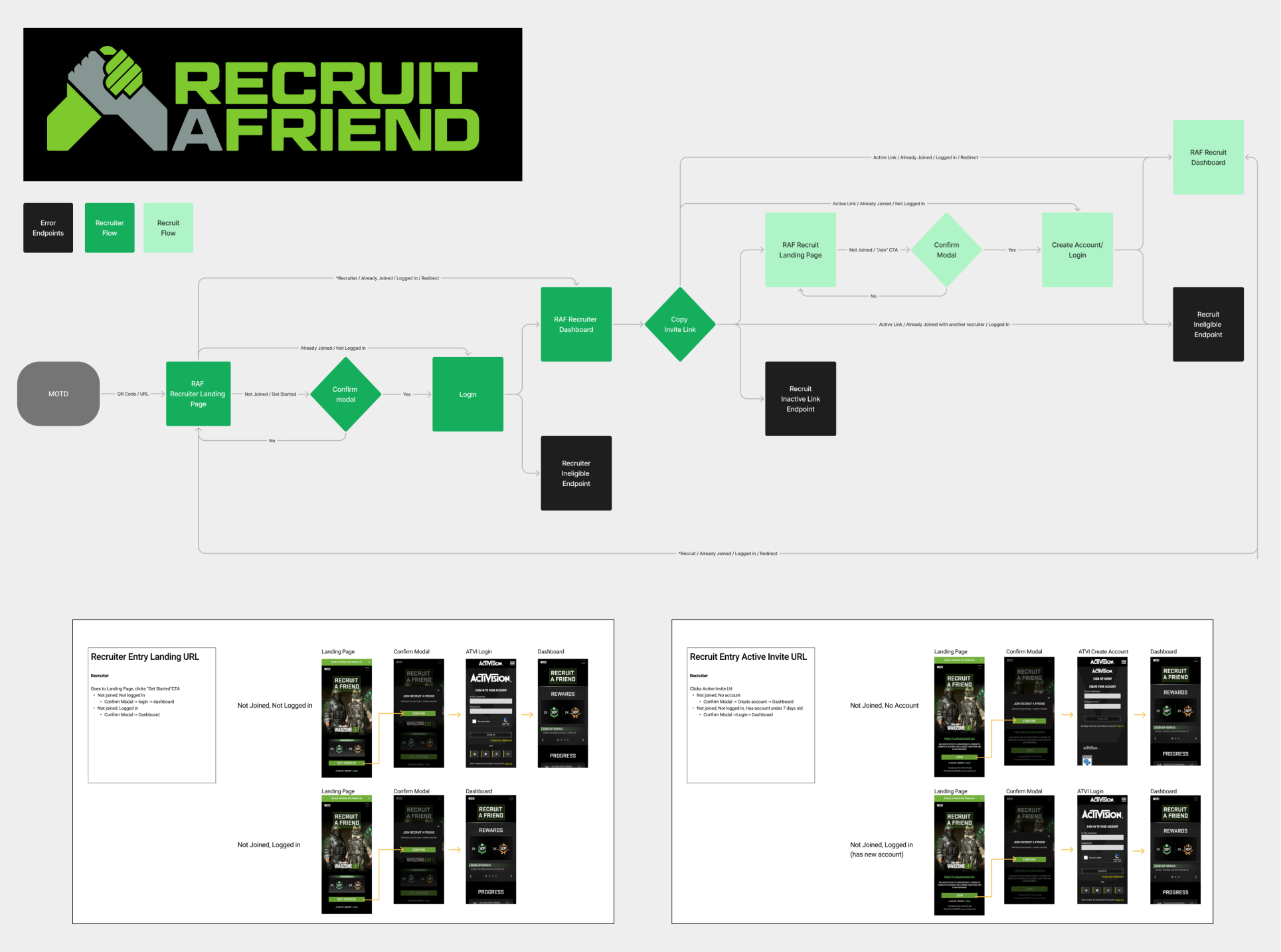
User flows to coordinate both Recruiter and Recruit journey
Challenges: We needed to track multiple players at once, ensure the in-game and web components worked well together, address privacy concerns, and help players onboard smoothly.
Approach & Outcomes: I designed an intuitive web interface that complemented the in-game experience, ensured compliance with privacy regulations, and developed clear onboarding and progress tracking systems for users. While the cross-platform experience was successfully delivered, offering rewards just for signing up didn’t drive long-term engagement, as many players claimed rewards without completing the program.
Learnings: Eligibility restrictions limited participation, underscoring the need for broader accessibility and stronger incentives tied to active participation rather than just sign-ups.
Experimentation Platform
As the lead UX/UI designer for an internal experimentation platform, I played a key role in transforming a test documentation tool into a comprehensive A/B testing interface. This platform enabled users to launch tests, manage audience segmentation, and analyze results effectively. My responsibilities included conducting user interviews, performing competitive analysis, prototyping, designing UI, and user testing. I worked closely with the product lead and oversaw the work of a fellow designer, delivering numerous features that optimized the platform's usability and functionality for cross-functional internal stakeholders.
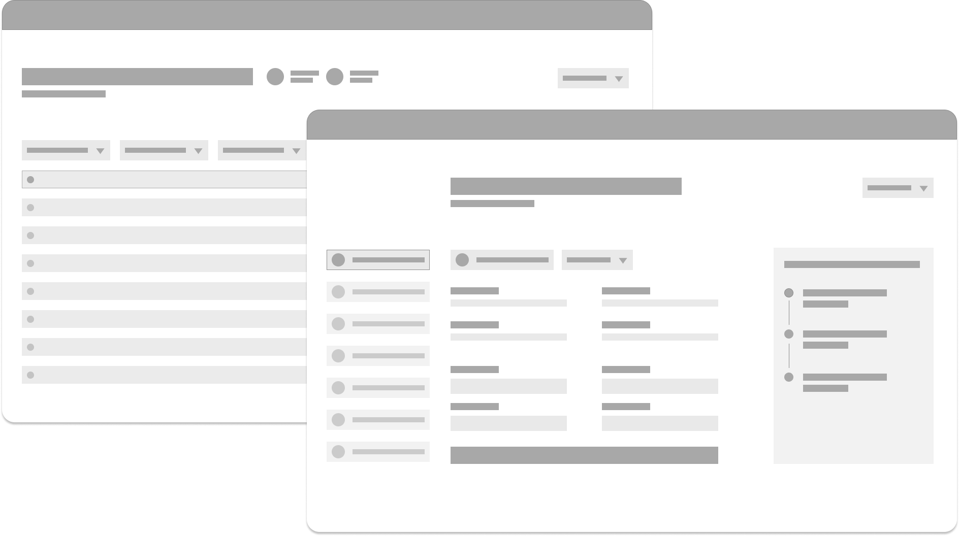
Abstracted UI mockup for privacy purposes
Project Insights
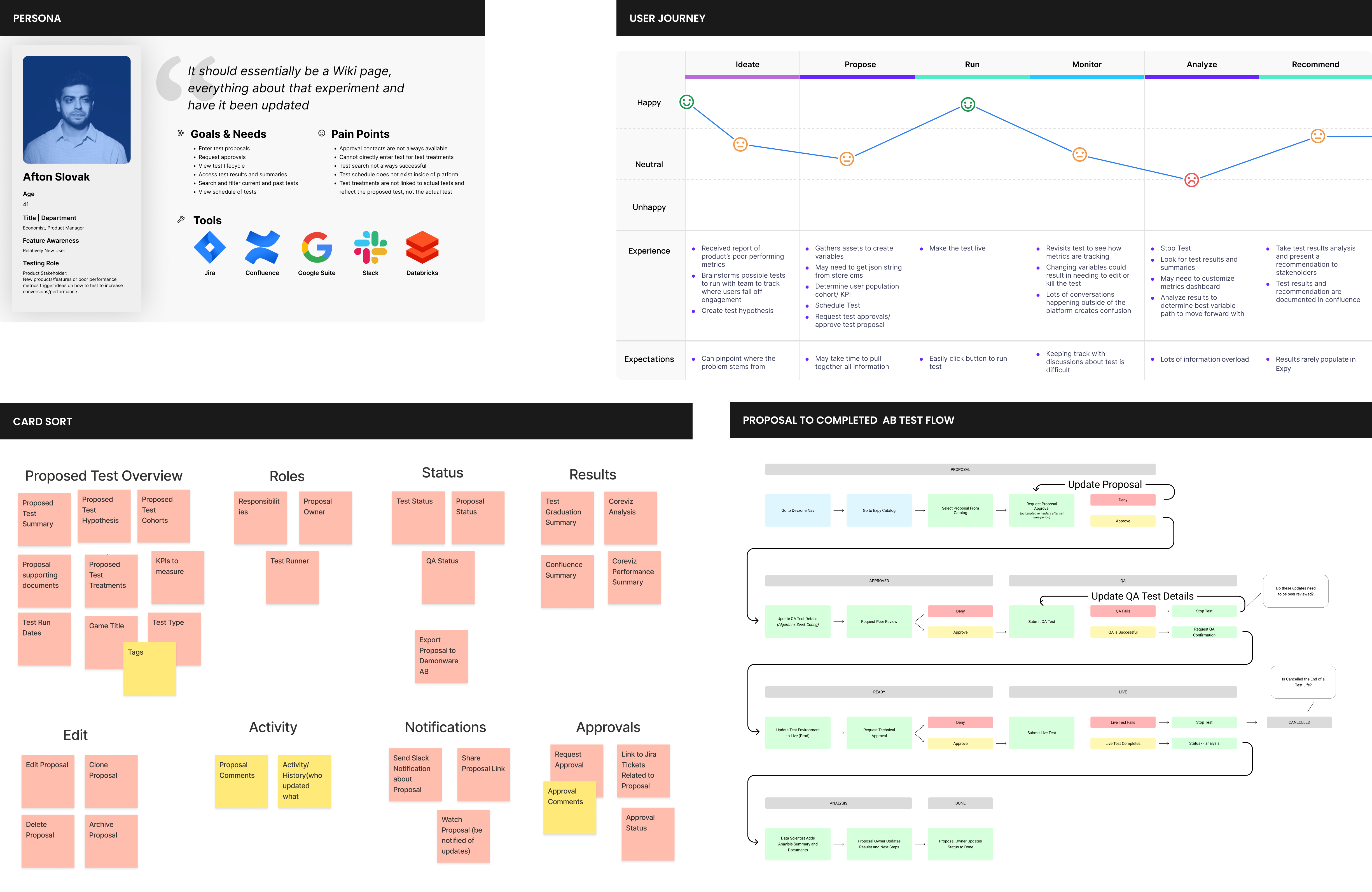
Process artifacts that led to application architecture
Challenges: Designing a flexible interface to meet the diverse needs of various stakeholders presented a significant challenge. Additionally, we faced technical hurdles such as migrating a test launcher with version control, building a segmentation service, and automating test statuses. Gaining stakeholder buy-in was crucial, as many were accustomed to external ad-hoc solutions.
Approach & Outcomes: We delivered a user-friendly interface that allows for customizable audience segmentation and streamlined test management. Through collaborative feedback and a clear strategic roadmap, we engaged various internal teams to ensure alignment and secure buy-in. The platform is now actively utilized to support experimentation needs across departments, enhancing overall efficiency.
Learnings: User feedback highlighted that automation and visibility into test progression were essential for broader adoption. Our consistent user testing practices provided valuable insights, enabling us to understand how users applied the platform and allowing for timely adjustments that improved the overall user experience.
Reflection
Challenges
- Managing communications across multiple teams and stakeholders in a large organization can be complex and time-consuming.
- Working on features for a franchise with a large, vocal user base can feel intimidating due to high expectations.
- Updating massive, interconnected systems requires caution, as even minor changes can have wide-reaching impacts and take considerable time.
Successes
- Developed strong collaboration and communication skills, ensuring alignment and smooth coordination across diverse teams.
- Gained confidence in navigating feedback from a passionate user base, translating their input into features that enhance the franchise.
- Successfully executed large-scale system updates by adopting meticulous planning and ensuring minimal disruption to interconnected systems.