Studio 2
IxD 310
This course focuses on microinteractions. Microinteractions are
the small pieces of functionality that are all around us. Focusing on them is the way to create a superior
user experience.
Examples: which way should a carousel scroll on a webpage when user clicks a button with this arrow: > ?
Left or right?
When a mouse wheel is moved towards the computer screen (away from the user) which way should the page
scroll - up or down?.
Professor
Maxim Safioulline
Timeline
February 16 – July 15, 2021
Role
UX Research and Design
Tools
Illustrator, Adobe XD, Figma, After Effects
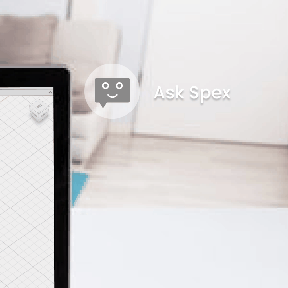
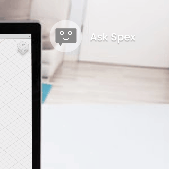
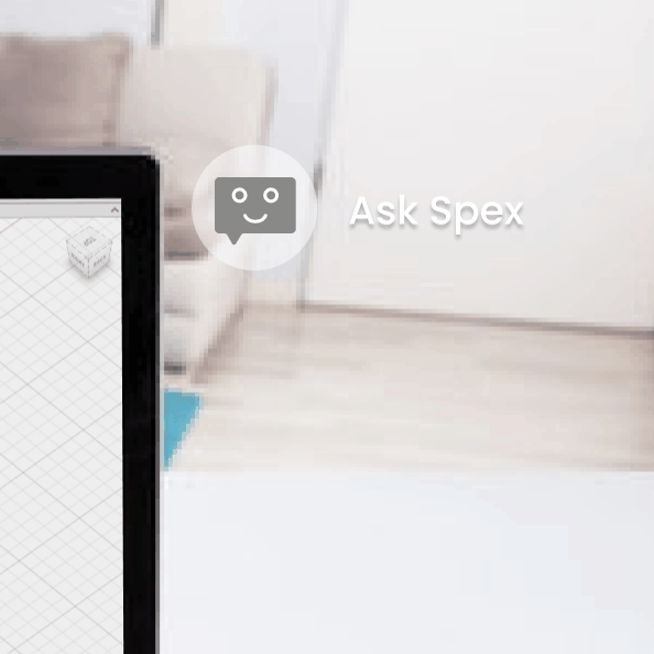
Final Project: Spex Case Study
Spex Case Study
After a successful final presentation, we gathered all of our documentation and project artifacts to compile a
case study of our product and process. Probably the most important part of design, but sometimes the most daunting,
making the case study can often remind you of all of the plot twists and turns from inception to completion.
The process of creating Spex was a joy. Our team collaborated well, brought unique skills and ideas to the table,
were flexible in our ideas, and challenged each other to push our idea further.
We learned that with new technologies, half of the battle is helping your audience understand the concept in the
first place. Even though immersive technologies have been around for some time, the possibilities and delineation of
processes are still somewhat ambiguous to most. In addition to refining our product design, our process was very much
about context and learning how to tell the story of Spex without overwhelming people with the technology.
Final Project: Concept Presentation
Concept Presentation
The feedback from our refined UI helped us to connect the dots in our final concept presentation.
We had shown a variety of UI modalities separately but needed to move towards visualizing them
together. We created animations that combined the physical product with the UI as well gesture
and visual UI together.
We also realized we needed to better tell the story of Spex as a collaborative network. We re-introduced our
original personas and showed what role they would play in how Spex is used.
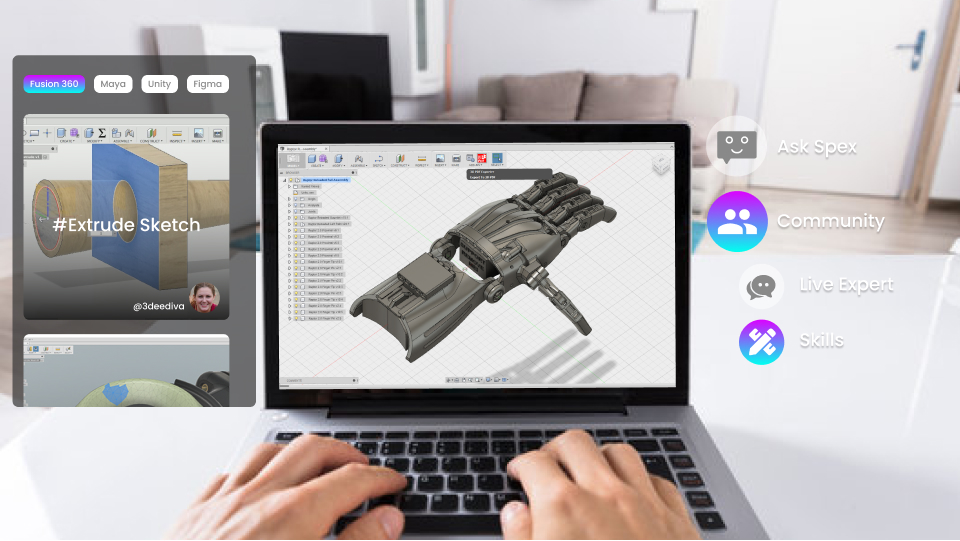
Final Project: Refined UI
Refined UI
After our heuristic evaluation, we realized we needed to establish gestures and specific
voice commands to accompany the visual UI. We also wanted to show the visual interation that would
accompany voice commands as well the UI for some of the primary use cases, such as browsing skills.
Final Project: UI and Heuristics
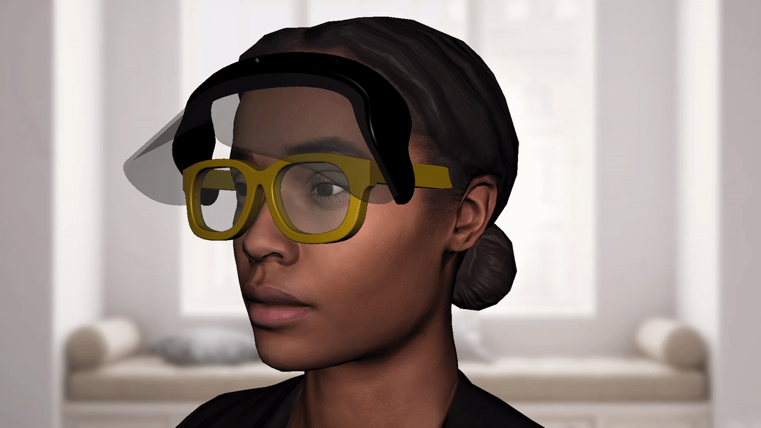
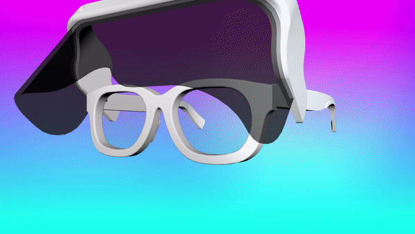
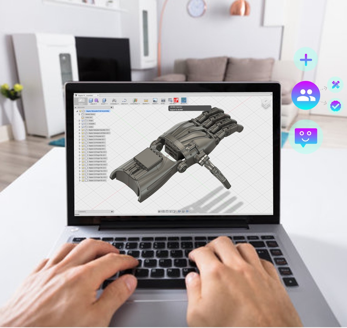
User Interface
The next step in our final project was to create a first draft of our user interface. Our system is for
Spex, a smart AR/MR headware that assists learning of technologies and operations. Wearing this device,
the user can see their natural environment with overlaid information and options to view skills, create skills,
and/or reach out to a verified expert.
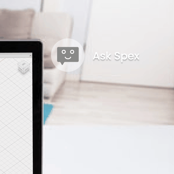
We imagine this device to rely heavily on voice interaction. There would be a minimal icon
in the user field of view that would serve as an expandable menu for more options. Users can ask
spex for help learning a specific function by saying "Spex, show me how to. . .". While there are visual
UI icons to confirm voice commands, the primary input will remain voice.
Lastly, we performed a heuristic evaluation of our initial UI pass. We learned that there are many functions
we had yet to anticipate such as account creation, community interaction, and what the skills creation interface
might look like. These will be addressed in the next round of UI development.
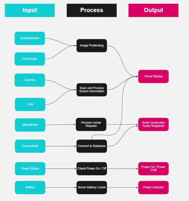
Final Project: System Diagram
Diagram
The purpose of this exercise was to consider the technical and material components of our proposed systems and how they will interact together.
For our product design class, our team created concept sketches. We considered the various componenets that would be needed in
AR glasses such as a camera, laser, wifi, battery source, audio in and out, etc. We looked at all of the input components, their processes,
and the resulting output and built a diagram. We also illustrated storyboards to help show the system flow. This process brought up key questions
about the need for certain components and how they would behave. Do you really need a power button or should the glasses just sleep when not
being used. Do you really need a touch UI if the primary interaction is voice and visual input? These questions are ones we are still trying to
answer and will hopefully develop further with feedback and iteration.
Final Project: Project Proposal and Characters
Proposal
Adjusting to new tools and software in a professional environment can be challenging. Looking for help on
the internet
is often time consuming and disrupts the productivity of employees. But what if we could get instant help,
right when
we need it? Our goal is to provide you with a tool that will allow you to learn quickly with visual
solutions without
the need to disrupt your workflow. By utilizing AR glasses, concise instructional content, and metadata,
we can provide
visual assistance overlaid onto your workspace quickly and more efficiently. We imagine this to be a
collaborative
platform where the instructional content is provided by the users as well, potentially incentivized by
monetization
of content views.
Character 1: Jeremy
28 year old Jeremy Diaz lives in a studio apartment in Denver, Colorado. He grew up in Fort Collins,
not far north of the city raised mostly by his single mom and older sister. When his sister Monica moved
out,Jeremy was in junior high. He was never the best student, but having Monica around helped keep him in
line. With her gone, he started slacking off at school and struggled to stay motivated.
Even with his so-so grades, Jeremy was accepted to the state college, but had a hard time focusing and
dropped out at age 19. He spent a few years working odd jobs and spent his free time drawing. A friend asked him
to create a logo for his small business which prompted Jeremy to learn how to turn his drawings into digital art.
Seeing his creation come to life sparked something in him that he hadn’t felt before.
Little by little, Jeremy began to take steps to learn more about design. He took some online classes and
picked
up more freelance jobs from friends. He wanted nothing more than to quit his delivery job but was too
scared to
apply for a real design position without a degree. One of his freelance clients referred him to an apparel
company
that was looking for an in house designer. After scrambling to put together a portfolio and got the job.
After a year at the company, Jeremy’s manager asked if he could do some small animations for some
promotional
social media content. Without hesitation, Jeremy said “Sure, no problem.” He was always a self starter and
didn’t
want to risk losing the job that he had worked so hard for. After scouring motion and animation tutorials,
Jeremey
realized he needed some help. He had so many questions, but had a hard time finding the answers he was
looking for
and was feeling lost in information overload. He wondered if there was a better way to sift through all of
the
content to find the answers that were specific to his needs.
Character 2: Emma
Emma Sheldon, a 32 year old motion graphics designer, lives in North West London in a flat with her
girlfriend Sarah. Born and raised in France, Emma took some time to travel after high school before attending
a design school in New York in hear early twenties. Missing Europe, Emma moved to London for a job at a
design firm when she was 28.
Emma always loved creating characters. Ever since she was little, she drew in the corners of her notebooks
as school, flipping the pages to make the drawings move. She thought one day she might be an animator, but
when she took motion design classes at school, she realized she loved the whole process, not just the animating.
When her friends were out socializing, Emma stayed in to geek out on new software and tutorials. She loved
learning new tips and tricks and creating visual effects. Sometimes she got frustrated by finding the right
tutorials though. They were either too long with not enough useful information, or too fast and skipped steps.
She thought she could do it better. Sarah always encouraged her to create her own tutorials, but she didn’t
know where to start. She wondered if there was a platform that could help her format the information she wanted to share.
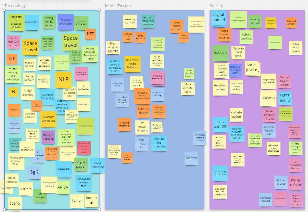
Final Project: Design Research
Brief: re-imagine what a collaborative workspace process could look like - what tools we would need, what
processes could we implement, what methods could we employ to create a better setup for co-creation
Scenarios and Observation
Our final project brief challenged us to look at how work has changed due to the pandemic and re-think
the tools
and processes we use. My teammates and I focused on the challenges of learning new tools and technology.
In class we
used a miro board to ideate on new ideas in tech, media, and society. After downselecting topics from
those categories,
we brainstormed scenarios in which those new ideas could be applied to learning new tools. In addition to
creating
scenarios, we kept an observation diary of our experiences learning new technologies. I focused mine on
learning
Gravity Sketch on the Oculus.
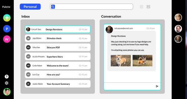
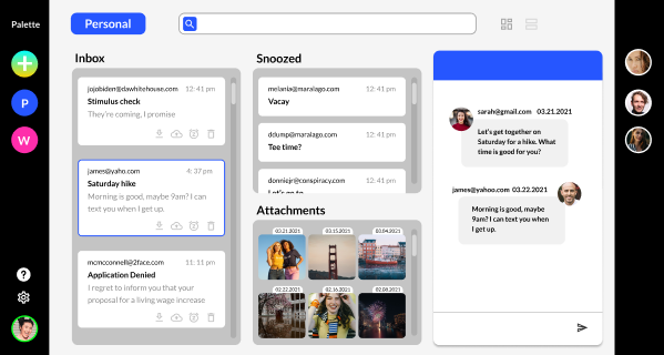
Midterm Project: Redesign Email Client Part 2
Revised Prototype and Presentation
After presenting our prototype concepts to the class in round robin style,
we took into consideration the feedback we received. We recognized that even
though we wanted to eliminated email threads and present a more conversational view,
many people still need a more standard email option for longer or more
formal correspondence. Ultimately we kept the same customizable layout, but
tried to better utilize the space and allow for flexible email options.
Download Presentation
Midterm Project: Redesign Email Client Part 1
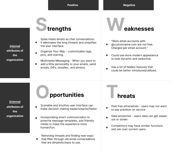
SWOT Analysis | Spike
The challege for this project is to redesign the interactions users have with desktop email clients. My
teammate and
I started by performing a SWOT analysis of two existing email clients. Spike attempts to shift email
threads into
converstaions to eliminate long chaings. It encourages multimedia messaging and provides a more
lighthearted
approach to email. On the flip side, keeping things simple can lead to hidden features.
 Spike Email UI
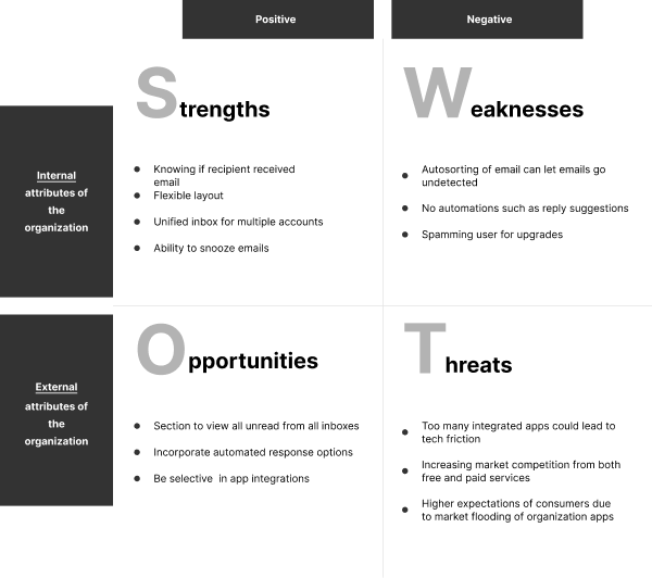
SWOT Analysis | Mailbird
Another email client we evaluated was Mailbird. A common praise of Mailbird was for it's ability to
handle
multiple inboxes. The snooze feature was also highly valued. Unfortunately, the organizing filters may
work too
well in that users often found emails to be sorted as they arrived and they weren't able to easily scan
for
new messages.
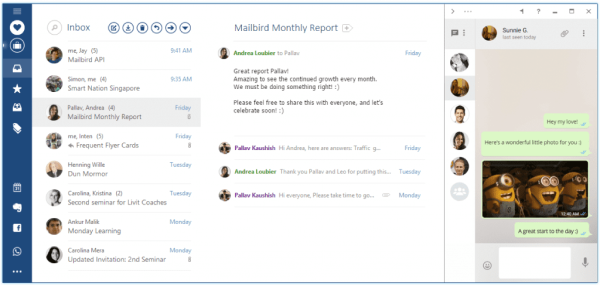 Mailbird Email UI
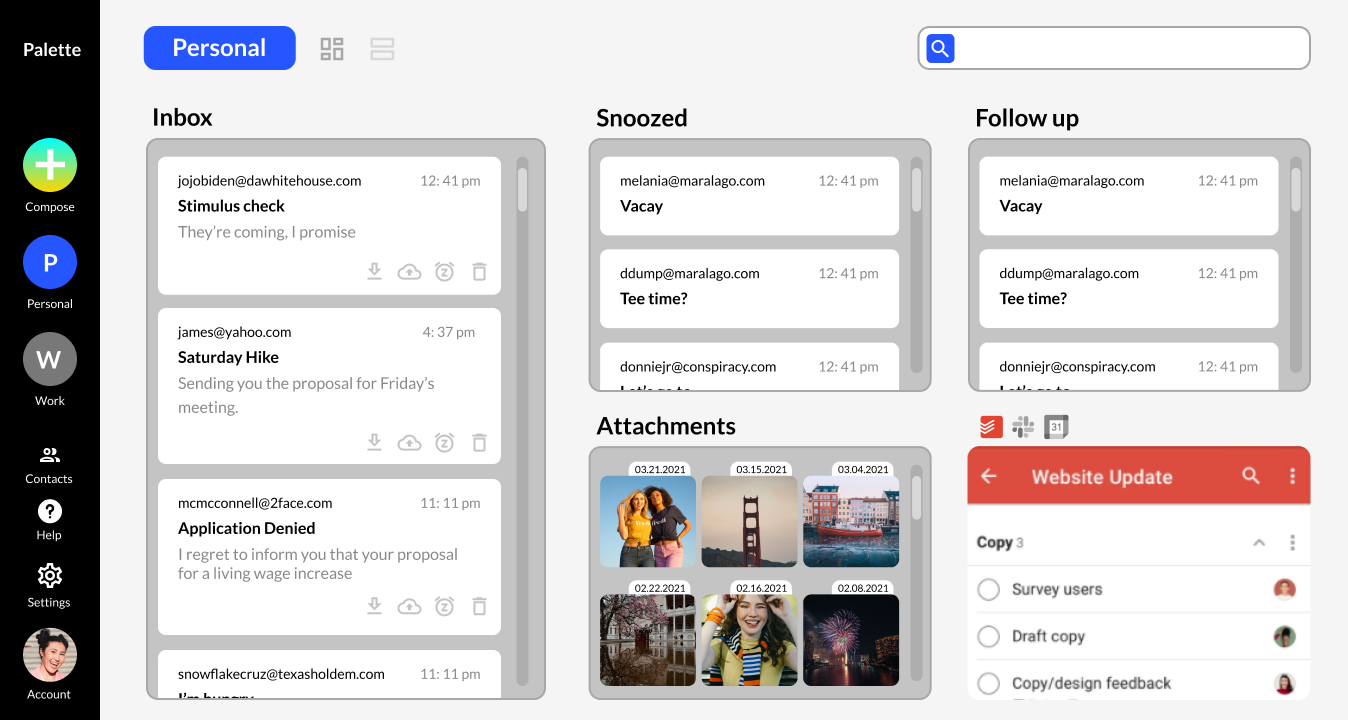
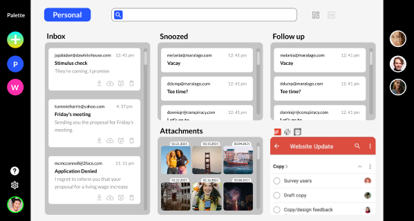
Concept | Palette
For our concept, we wanted to incorporate the most desired features in a layout that moved away from
the traditional lists of email. Our priorities were to include the option for multiple inboxes, viewing
email
chains as conversations, snoozing emails for later, app integration, and a kanban style layout with the
option
to customize boards with the categories that were the most useful to them. We called the concept Palette
to
reflect the idea that you fill you have the power to arrange your email board in a way that works for you.
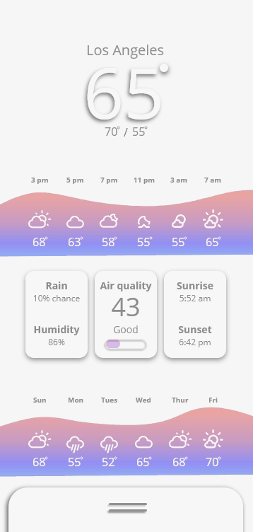
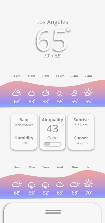
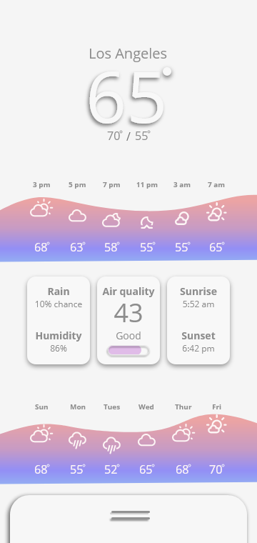
Microinteraction: Redesign
Weather App | Android
For this exercise, my teammates and I were tasked to redesign a weather app interaction on either
Android or iOS. With two of us haveing Android phones and two of us having iPhones, it was interesting to
evaluate and compared the existing weather apps. We collectively agreed that the iPhone app was more
informative with a nicer design but could have stand to simplify it's interface for easier digestibility.
The Android app on the other hand, was extremely simple and didn't provide enough information. Both
interfaces
required the user to scroll to receive all the information offered.
For our redesign, our goal was to improve the Android app by looking to the iPhone for inspiration while
maintaining simplicity. We also wanted to reduce the user's need scroll and focus the screen on the
information
that was most important to the user.
We updated the Android graph visual with a fluid background curve. The warm and cool colors of the
gradient fill correlate to the temperatures as well as the y position of the weather icons. We felt This
was a better visual alternative to the graph. We gave metrics like precipiation, air quality, and sunset
times
higher priority over weekly weather as it had to do with what's happening today.
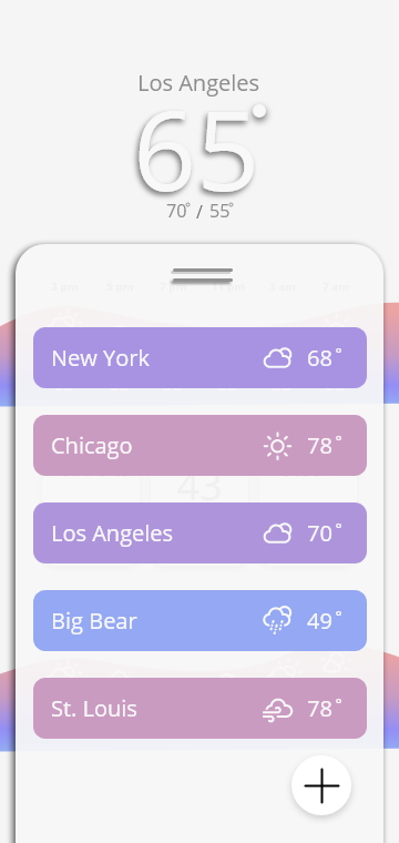
Lasty, rather than having the user scroll or swipe for alternative city weather information, we placed it
on a card that the user could bring into view while leaving the current city still prominently displayed.
Feedback, Loops, Modes
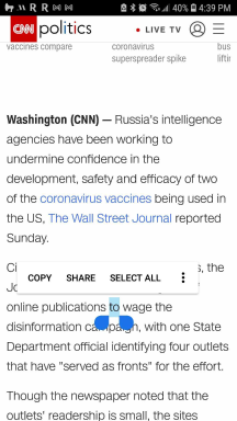
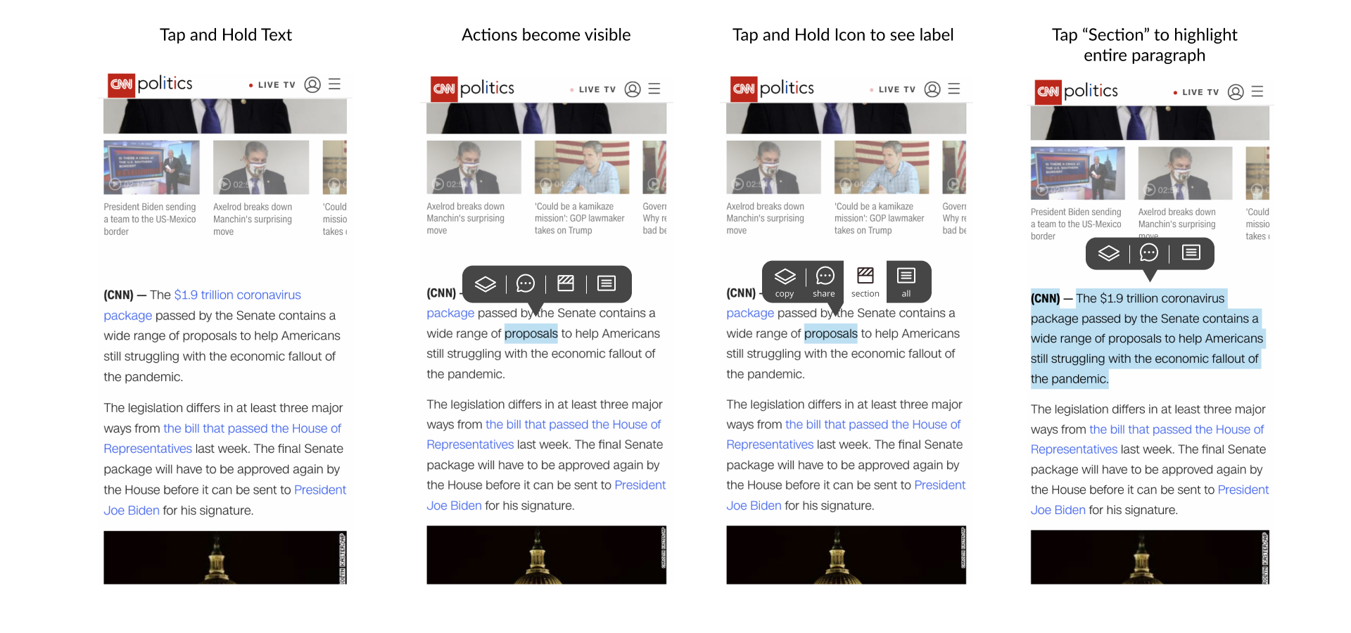
Recontextualizing the triple click
Select Some | Android
For this exercise, my teammate Cole and I looked and somewhat problematic microinteractions to
recontextualize and improve. We focused on the triple click in a browser that selects a paragraph of
text rather than all or just the word. This is a hidden feature that many aren't aware is there.
We looked at the select funtion on Android phones and noticed there was only the option to select all.
Selecting a paragraph meant cumbersomely dragging end point indicators are the desired text. Perhapss if
we updated the pop up options to include a "select section" and incorporated icons, it could be a more
effective interaction.
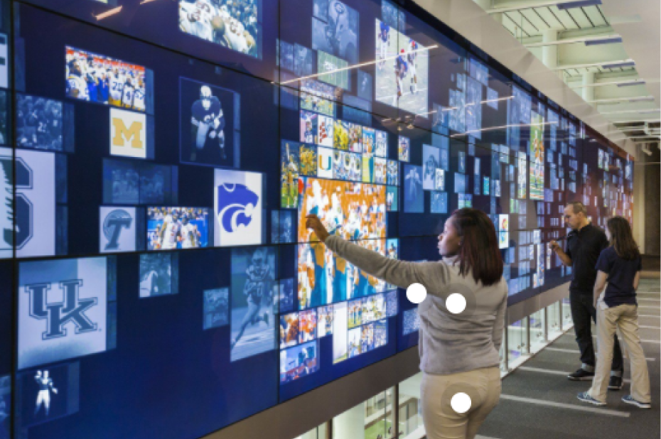
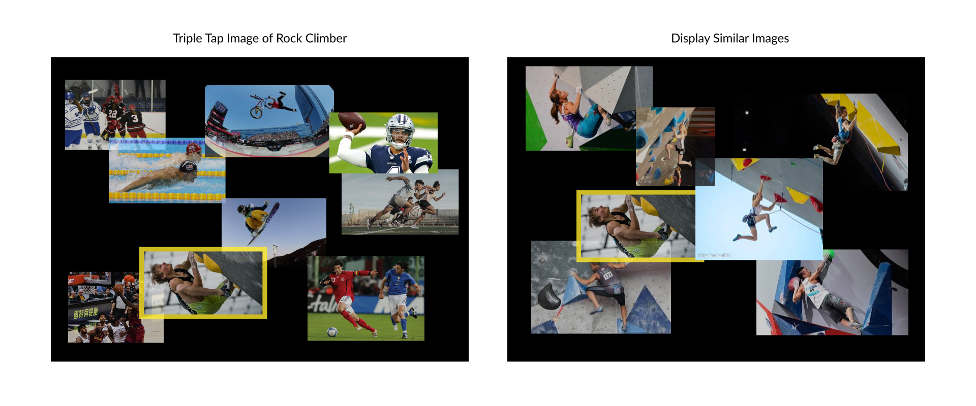
Agregate Similar | Museum Wall
In thinking about the concept of the triple click to select information within the context of a
museum touchscreen, we thought about a digital museum wall. Museums are gatekeepers to information.
What if in addition to learning about an item you touched, triple clicking that item would
agregate all of the related information that the muesum had access to?
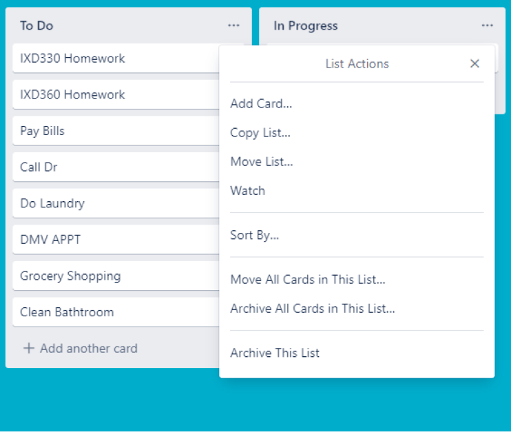
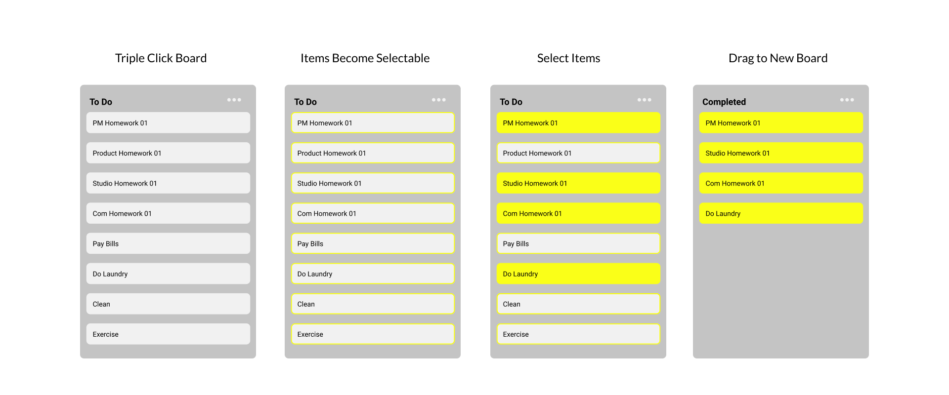
Select Some | Trello
Lastly, we imagined how the triple click selection interaction might appear in a web app.
We took a look at how Trello, a kanban board organizational tool, allows users to select items.
One can easily select one item to drag from board to board, but selecting more than one requires
opening the menu and only allowing you to select all. Perhaps if we applied the triple click,
all of the board items would activate and a user could grab the ones they wanted to move. After the
action,
the items would deactivate.
Feedback, Loops, Modes
See prior post for microinteraction references
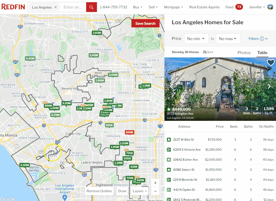
Switching Modes
I have a love hate relationship with real estate websites. I love looking for properties, I hate how
overpriced
everything is. My real estate service of choice is Redfin, mainly for their ease and convenience of
browsing listings.
I compared Redfin with Zillow to get a better understanding of why I gravitated towards Redfin.
Immediately I saw that
Redfin allows you to get a snapshot view of a property without disrupting your search. As shown in the gif
below, I can click
on properties in the map view of Redfin and the snapshot information is updated in the right panel with
the selected property.
If I try to do this in Zillow, a modal pops up and overtakes my viewing area. I can no longer see the map
and my attention
must be focused on that individual property view.
I much prefer the interaction on Redfin as it allows me to more seamlessly navigate all of the Los
Angeles properties that I
cannot afford. I can obtain all the information I need quickly from the sidebar as well as favorite it for
later viewing before
I decide to take a deeper dive. Redfin's absence of a close up property mode is more efficient and
pleasant for my needs.
Feedback Evaluation of Prior Examples
The end of scroll feedback in the NTC example used a pressure sensitive visual cue. I found
the feedback to be successsful in that it was non-invasive, quick, and got the message across clearly.
The swap language interaction from Google Translate was successful but had potentional for problems with
clarity. The animation was brief and clearly indicated a swap had occurred. However, given that many
countries
do not read left to right, there could be confusion as to which language is the input and which is the
output
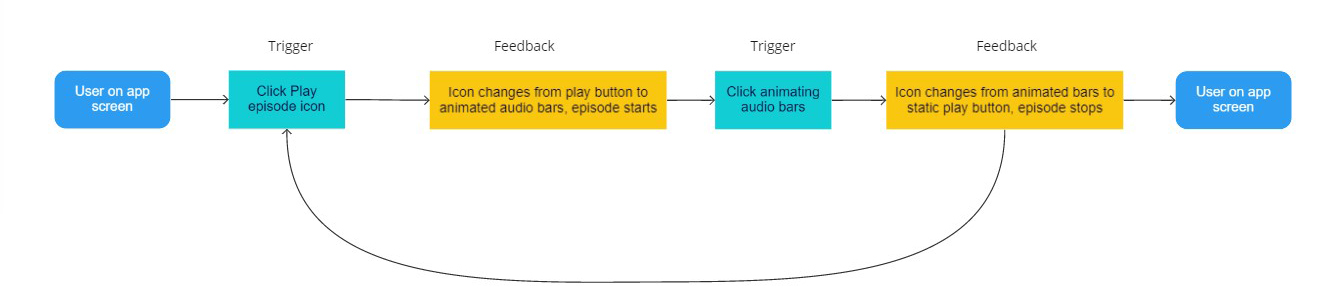
The Google podcast play button clearly indicates the action with animation, yet I am unsure if it is
necessary
for the animation to continue until the state changes again. A simple change of icon to pause perhaps in
green to
indicate that this is the actively playing episode could suffice with less distraction.
Decipher the Rules
Breaking down microinteractions
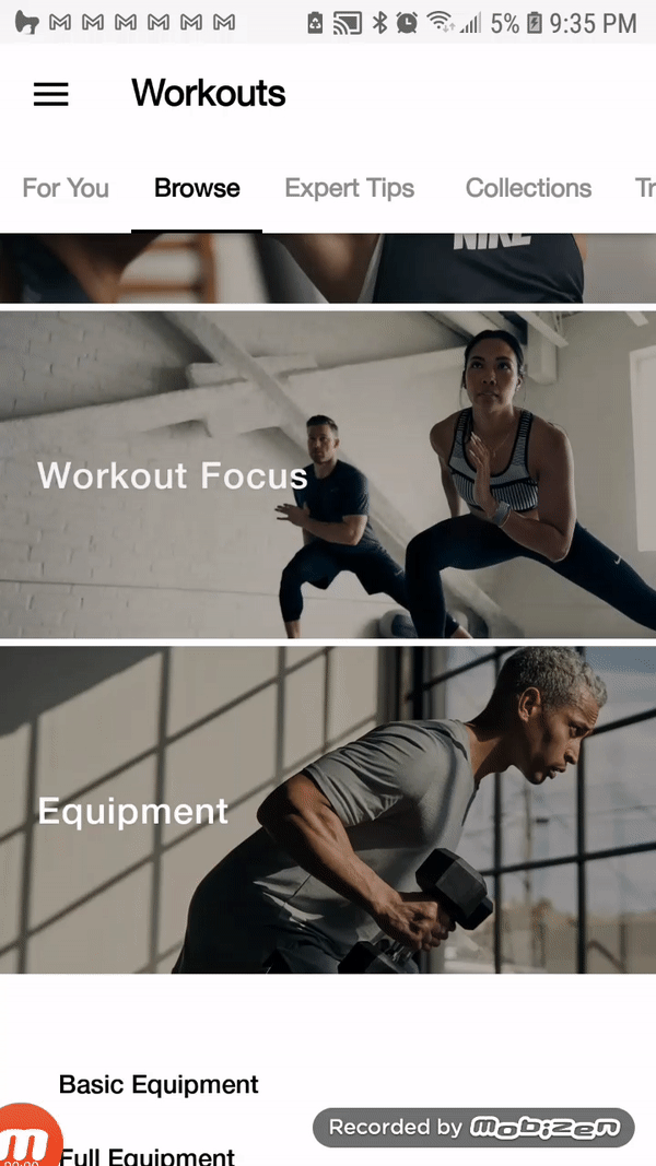
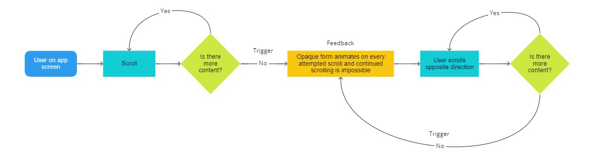
End of Scroll Inateraction
Nike Training Club Mobile App | Android
When I chose this microinteraction, I thought it was unique to the Nike Training Club
App, but I have since noticed it on a variety of other apps on my Android phone. It does
differ however in color from app to app. The interaction is triggered by the user scrolling.
When there is no more content, continued attempts at scrolling will result in a pressure sensitive
animation of a transparent abstract shape. The interaction will continue as long as the user
attempts to scroll and there is no more content. They could choose to scroll in the opposite
direction and reach the same result once they reach another dead end.
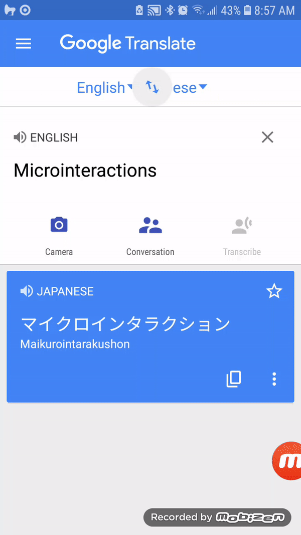
Swap Language Interaction
Google Translate Mobile App | Android
This is a simple user initiated interaction in the Google Translate mobile app. Users translate
from one language to another. Sometimes they want to swap the languages, often to check the accuracy
of the translation. Pushing the central swap button with swap the language input and output. The
interaction
concludes after one swap. It can be initiated again at any time.
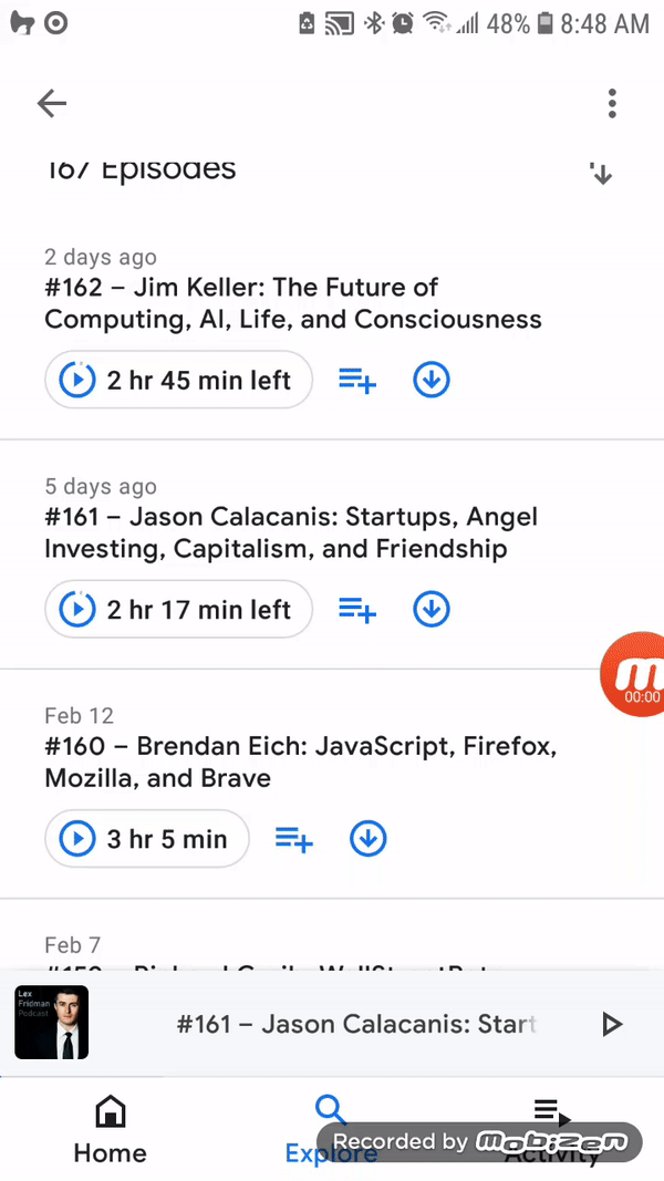
Google Podcast Play Episode Interaction
Google Podcast Mobile App | Android
Goole Podcast has an interactive play button for their episodes. Once the user triggers
the play button, the image changes into an animating audio bar icon to indicate the
audio from the episode has started playing. The animation will continue so long as the
episode is playing. When the animated icon is pressed, the interaction ends and the button
reverts back to the static play button.
Designing Microinteractions
Selected quotes from chapters 1 & 2
Insight 1
As DeRouchey says in “The History of
the Button”, “The button meant for the first time the result of the human motion could
be completely different from the motion [it creates] itself.” Action became abstracted.
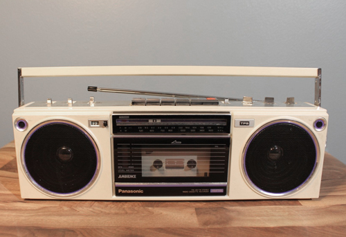
The portable radio cassette player pictured is what I grew up with. You flipped a switch to turn it on.
You turned a dial that was directly correlated to the volume level. You could see the physical bar
scroll
past the radio station channels as you manipulated the wheel. Pressing play turned gears that turned
wheels
that spun a physical cassette tape.
Much has changed since then. As the years have gone by, more and more buttons, levers, and dials have
slowly disappeared from my world. Replaced by voice commands and touch screens, I am less connected to
the things I am controlling. In some ways, this a blessing. I have fewer unique machines and things to
have to deal with and operate. The controls are more streamlined and consistent, and usually all from
within the comfort of my smartphone.
I've come to realize that many of the UI icons still tied to tangible interactions will likely soon
change as they have no meaning to today's generation. Using a floppy disc image to represent save or a
manual phone to end a video call doesn't make sense anymore. Just as our technology has evolved, so
must our visual language to control it.
Insight 2
Even more than with triggers, feedback is the place to express the personality of the
product. Indeed, feedback could be said, along with the overall form, to completely
define the product’s personality.
When trying to design a product or service, we're taught to focus categorize features by importance -
must have, should have, could have, will not have. We're also constantly being withheld from even thinking
about design until we have made understood the problem and made a blueprint for a solution.
Diving into the details of feedback micro-interactions may not initially seem that it carries much
weight in the grand
scheme of product design, but it is those details that separate your product from others. Those details
bring an
element of fun and surprise that make someone enjoy and remember their experience.
Google doesn't really need to do anything other than provide a search input field and return results.
However, they've chosen to create moments to bring a bit of joy to the monotony of surfing the web.
Their inclusion of a randomized search feature such as "I'm Feeling Lucky" or "I'm Feeling Generous" has a
choose your own adventure feel to it.
They could have stopped there and introduced you to something new
and interesting. Instead, they reward you for finding something new and offer animated feedback to
celebrate it.
These micro-moments set their experience apart. It's certainly won't make up for a bad product or lack of
other features, but when you've got a solid platform to begin with, these moments can take it to the next
level.
Insight 3
The third principle of manual triggers is to bring the data forward. The trigger itself can
reflect the data contained inside the microinteraction.
This quote makes me think of the now-classic hamburger menu and how it came to be. When I first saw one,
I had no clue what it was or did. Little did I know it was first introduced back in 1981 by Norm Cox with
the intention of representing a menu list.
If we are to reflect the data, then shouldn't we be using skeuomorphism in our icons? Unfortunately,
skeuomorphic design can create an inconsistent look across an application for a less engaging experience.
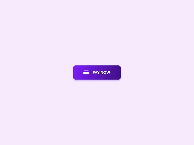
Perhaps we should be highlighting the action of the information as shown in these two examples. Having a
UI button for a light and dark interface toggle between a sun and a moon is a simple and universal way to
communicate the idea. I particularly like the animation of the pay now button that mimics the swipe of a
credit card to very clearly illustrate the action that is taking place. Of course, this may become
outdated
when we are all paying with bitcoin via our digital wallets, but these are some unique and clever ways to
showcase data with action and animation to help create a joyful and intuitive micro-moment.
“Pop-up error alerts are the tool of the lazy. If an error does occur, the microinteraction
should do everything in its power to fix it first”
Dan Saffer
Microinteractions, Designing with Details
Reflections
I am just beginning this class so I don't have anything to reflect on yet! I am looking forward
to digging deep into micro-moments and micro-interactions to find the heart of what makes an
experience memorable.