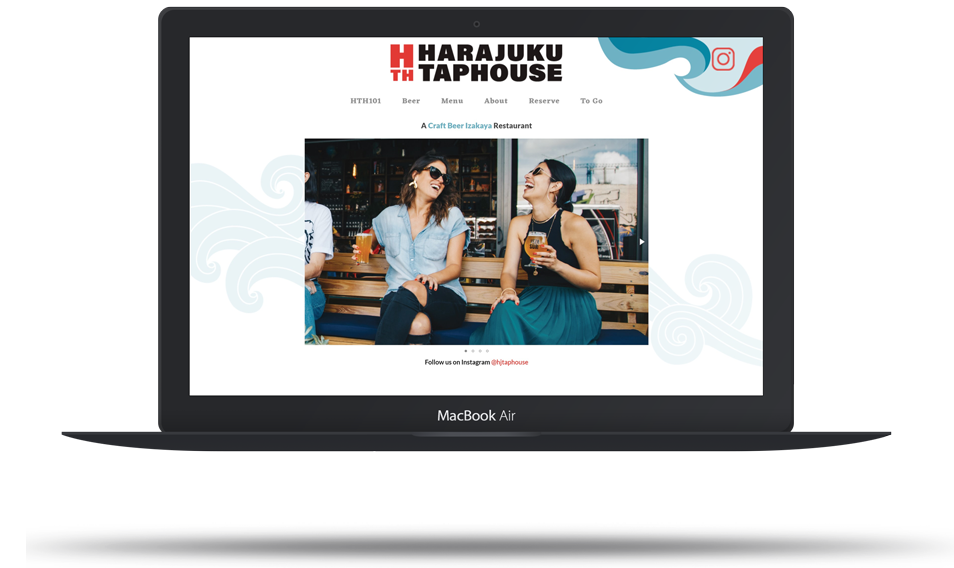
Harajuku Taphouse
A Craft Beer Izakaya Restaurant
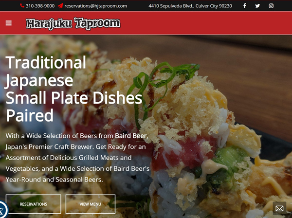
Competitive Research
- Authentic
- Dated visual design
- Online ordering available
- Focus on high caliber chef
- Modern, artistic visuals
- No online ordering

- Upscale Vibe
- Table booking call to action
- Online ordering available
- Jumpy navigation
- No online ordering
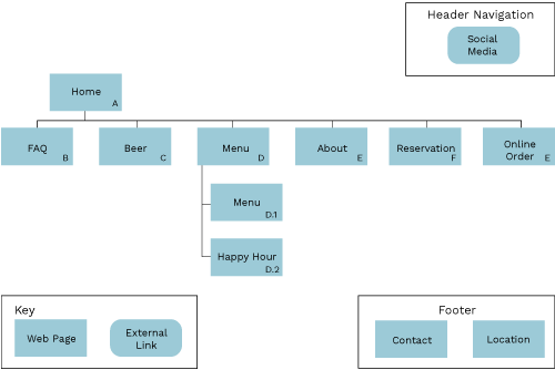
Proposed Sitemap
Keeping the navigation on the same level and eliminating duplicated information will make the user exerience more straightforward. Keeping a call to action for online orderng and reservations will make it easier for busy users to get what they need.
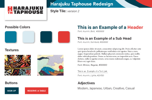
Proposed Style Tile
The red is a carryover from the current identity, but with a more contemporary feel. The logo is modernized and the wave header theme is inspired by the Japanese murals painted on the side of the restaurant exterior.
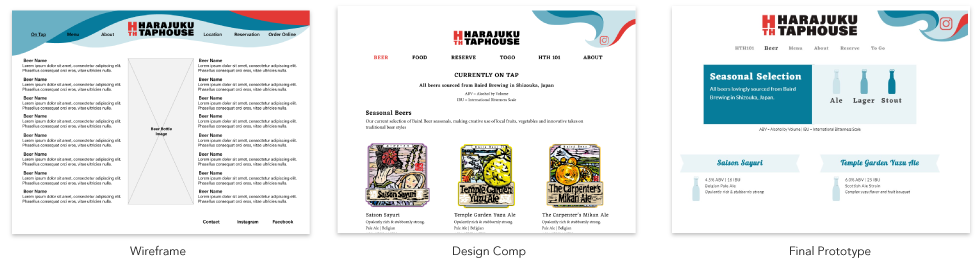
Wireframes to Comps
The layout evolved quite a bit fromt the orignal wirefreamse. Using the existing beer labels had an interesting look, but still felt too cluttered for the more contemporary identity. I moved to minimize their presence and use icons to indicate styles of beer.
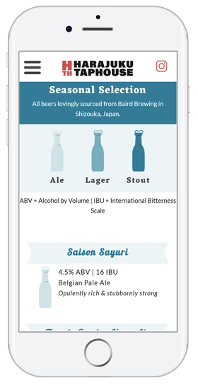
Mobile View
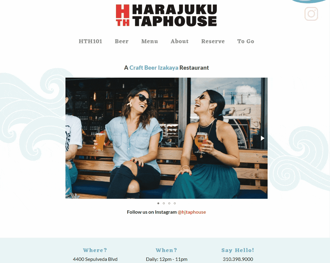
Desktop View
The desktop site is a one page scrolling site. It features a simple, informative section dedicated to explaining izakaya style food and craft beer to new patrons.