Challenge
The challenge was to redesign a mobile app of my choice
excluding gaming, finance management, and training. I chose the
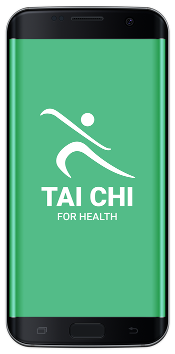
android app, Tai Chi for Health. I was inspired by my personal
interest in learning Tai Chi as well the desire to improve the
usability and visual mood of the app. The result was a
reimagined mobile app prototype.
Role
Research, UX, Prototype, Mobile Design
Timeline
April 18, 2019 – June 09, 2019
Tools
Illustrator, Adobe XD, Paint 3d, Procreate
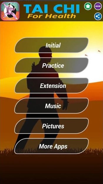
Problem
We have observed that the disorganization of the current Tai Chi
instructional mobile app conflicts with the expectations of the
user.
How might we simplify the organization of information and create
an experience that educates as well as relieves stress?
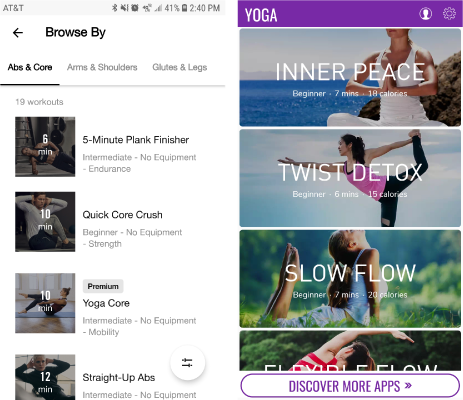
Comparative Analysis
Popular yoga and fitness apps use larger visuals making it
easier to choose your navigation.
Target Audience
- Older Adults
- Stressed Busy Professionals
- Injured Fitness Enthusiasts
Empathy Maps
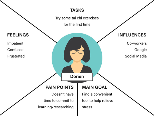
This empathy map reflects the motivations behind the stressed
professional user group.
Storyboards
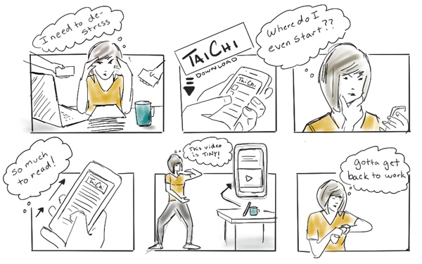
Imagining how Dorien might try to fit in some Tai Chi at work
and struggle to find where to even start indicates she might
close the app before she even has a chance to use it.
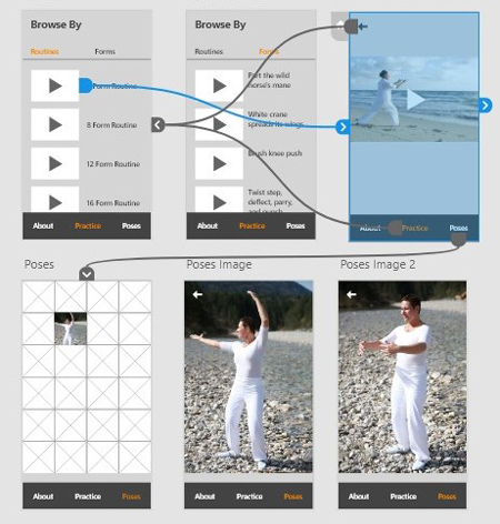
I want to do: View practice videos
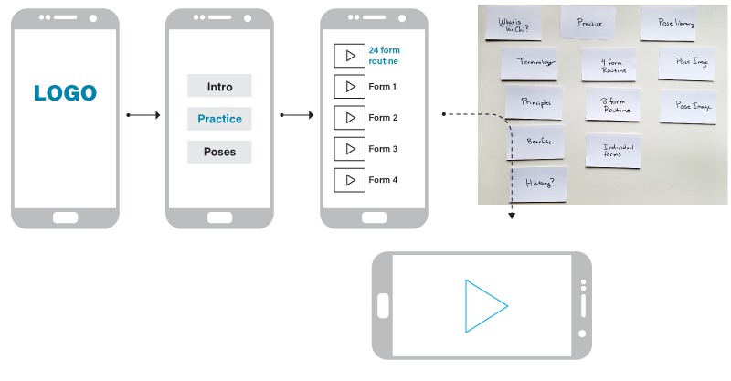
Visual Flow
Card sorting was based around micro-moments, imagining how a
user could easily navigate when they want to “know” or “do”
something, illustrated in the visual flow.
Early Testing
Testing the early prototype with a few users gave valuable
feedback before I invested time into a more detailed design
Francisco Link to Test
- Occupation: Student
- Mobile Device: iPhone
- Familiarity level of Tai Chi: low
Insights
-
initial get started or walkthrough feature could be helpful
-
More meta information next to the videos such as duration
would be useful for personal filtering
-
The Tai Chi Term "forms" is initially confusing and may lead a
user to think they have to fill something out
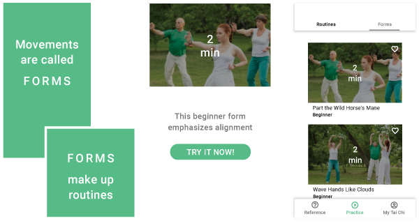
Iteration
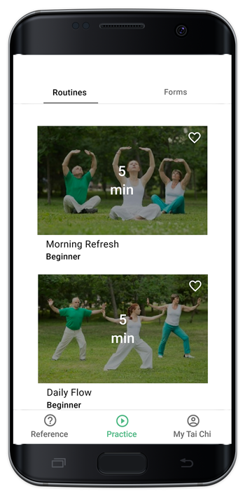
Based on insights from testing I added a brief onboarding to
explain key terms, a call to action to engage users more quickly
and informative metadata to help guide users through the
experience.

Microinteractions
To add to engagment, there are a number of animated
microinteractions triggered by user actions throughout the app.
All of these moments will help the provide feedback and increase
the feeling of interactivity.
Reflections
This project highlighted the value of simplicity in design. The
original app was made by someone who loved Tai Chi which showed
in the amount of information that was included in the app.
However, so much information will never be digested if the user
doesn’t engage because they are overwhelmed or lost. I tried to
practice simplicity and focus on the primary needs of the user.